Have you ever heard of ACME soap? I can’t say definitively if the company still exists, but it was a soap brand from the early 1800’s. Growing up, my grandma’s bathroom was wallpapered with ACME Soap themed wall paper. It had various advertisements, pictures, logos, etc all representing the ACME Soap brand. I have memories of looking at the various artwork while doing my business there.
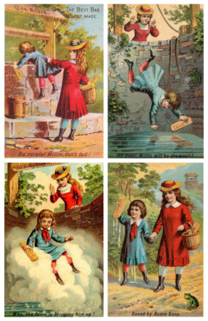
One of the most memorable ones was a four panel story of a boy that falls in a well. He is holding a bar of ACME Soap, and it lathers up so much that it lifts him to the top, thus saving him. Below are the four panels as seen in the official trading cards.
When the bathroom got remodeled, each grandchild was gifted this four panel advertisement framed for us to put in our own bathrooms, which we did.
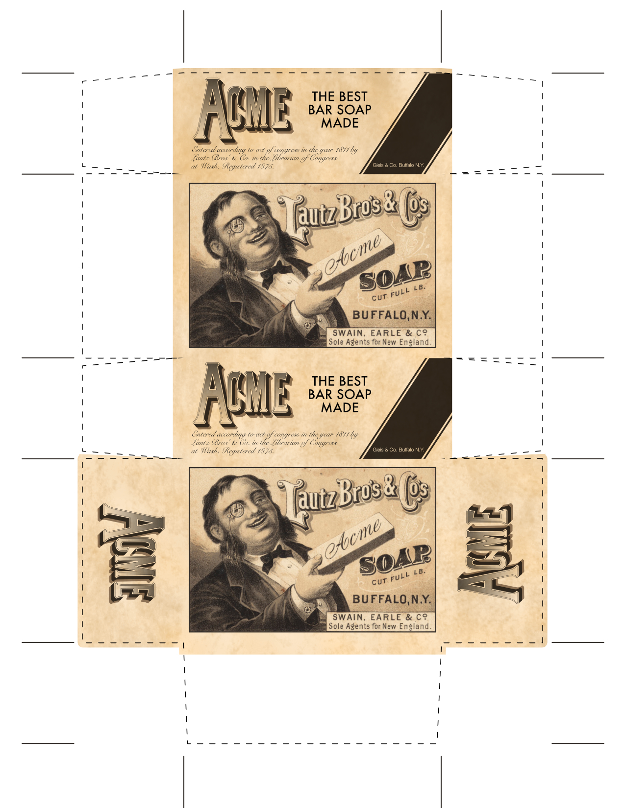
I felt that the picture frame looked a little lonely on its own, and thought that making a soap box to accompany it would be appropriate. Although not at all historically accurate, I took the dimensions of a modern soap box, and styled it appropriately.
I found a graphic that was actually used on the antique soap boxes that depicts a man holding a bar of soap. I recreated the ACME logo and added some verbiage and legal text that I could find on various images of their products. According to what I found they were founded in 1811, and the trademark was registered in 1875.
I used an old paper texture to make it look more aged.
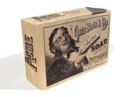
I printed it out on card stock, cut it out, and glued it up.
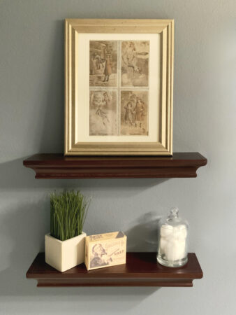
Now it sits and complements the original wall paper that sits on display in the bathroom.
Since Adobe’s move to subscription based software, I have stopped updating my Creative Suite. I had purchased CS3, and CS5. I was planning on getting CS6 or 7 when it came out, however after the release of CS6, Adobe axed the purchasable software and moved exclusively to the subscription model. Subscription makes sense in many settings (mostly professional). People who use the software daily for business, or people who have to continuously be using the most recent release can easily justify the cost. Paying the monthly sum is more affordable than paying the full purchase price and upgrading every year, or even every two years.
For me, CS5 was good enough that I was able to use it for a long time even though I knew that time was coming to an end. Each new release of Mac OS X was breaking features. WYSIWYG fonts broke around 10.7, using the color picker on raster images caused crashes around 10.8. I was willing to hobble along because the core functionality I required was there, and in all respects, and it generally worked very well.
Well, mostly well enough…
Over the years, I’ve looked for alternative programs. I looked at Sketch and Inkscape to replace Illustrator. I’ll be completely honest. I can’t stand InkScape. I appreciate that it is opensource, and applaud the amazing work that’s been put into it. I keep it installed and I resort to it from time to time because it works really well with SVGs, and it is also very scriptable which is a wonderful feature for some of my automated tasks. But when it comes to using it daily, I just can’t. The interface is too different from what I am habituated, and it’s not pretty or polished. For a long time it required X Windows/X Quartz to be installed, and didn’t present an integrated experience with the rest of the Mac.
To replace Photoshop, I purchased Pixelmator. It’s a great little program, and I really wanted to like it. It has a great OS X interface and is smooth and polished. I purchased it ages ago before giving up CS5 knowing that someday it would be inevitable. My goal was to use Pixelmator when my work called for photo editing, and not resort to Photoshop. Unfortunately, the workflow was sufficiently different from what I was accustomed that most of the time I ended up back in Photoshop. The differences in approach to UI caused just enough friction that I never used it enough to become proficient.
As for InDesign, I didn’t really have any affordable options that fit the bill. I have QuarkXpress, but don’t love it.
Finally a few years ago, I saw Affinity Photo being advertised at a reasonable price, and so I bought it and gave it a shot. (At this point Affinity Designer was on the cusp of being released). Affinity Photo felt much more familiar to me than Pixelmator off the bat. I found that I could slip right in and keep using it the way I was using Photoshop. Some of Affinity Photo’s idioms perplex me. At times I need to do some searching in order to complete a task that I could have done instantly in Photoshop. Aside from these little learning issues, it’s really pretty dang good. The differences that annoy me on the onset make sense once I see how they intended for the user to do that task.
My primary use case for Affinity Photo is doing photo touch ups and alterations. Usually this will involve multiple layers with masks, lens correction, and airbrushing/healing tools as well as the adjustment layers for color correction.
Since I had a positive experience with Affinity Photo, I decided to buy Affinity Designer sight-unseen. I was sold on it immediately. It too has some quirks, and I am still learning new things about it as I go, but for the most part, it’s been a great tool for everything I’ve needed it for. About a year ago I upgraded to Mojave and I did not bring CS5 with me. All of my professional work has been using Affinity Designer, and it’s been really great.
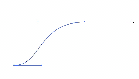
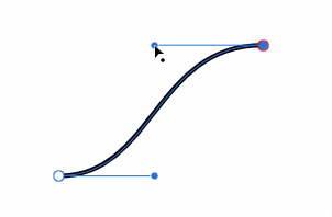
One of the great things about Affinity Designer that made me love it right away was the responsiveness. With Adobe Illustrator, when manipulating the handle of a bezier curve, a cyan colored outline of the curve will animate, but the actual curve you draw won’t present itself until you let go of the handle. I was so used to this being the case, that I never thought about it. In Affinity, the shapes animate in real time, which I think is fantastic.
The first task I used it for was creating an icon for an internal tool I was developing at work. The learning curve was not very steep and by the time I finished this icon, I felt pretty comfortable already.
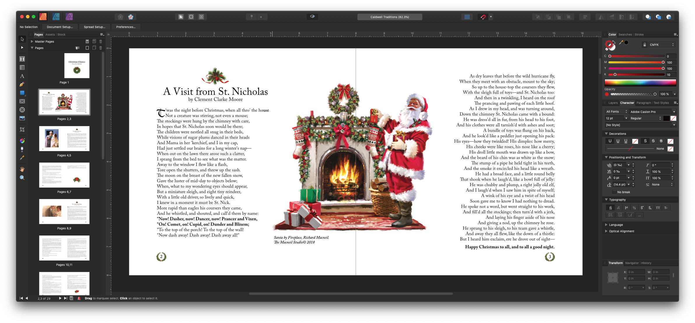
The last piece of the puzzle was a publishing program to replace InDesign. I had a small book that I was working on with my sister, and thought that this would be a good opportunity to test out Affinity Publisher. It was in beta at the time, so I downloaded the beta and got straight to work.
Everything was going pretty well until I got the text for whole book roughly laid out, sans-graphics. I began throwing in graphics, saved it and exited. I revisited it the next day, and was unable to open my file! I checked the forums, and it turned out to be a known-issue relating to placing graphics on a page-master. A new Beta had already been released which resolved the issue. I was so relieved when I was able to open that file. That was the only issue I’ve encountered with Affinity Publisher.
I worked with my sister and finalized the design, exported it, and sent it for printing. We got the prints back, and everything looked perfect.
These three tools from Affinity integrate with each other really well, and I’ve been extremely happy with the value of the products, the features, the stability, and the polished interfaces. They feel cohesive as a product family, and they feel very at home on my Mac. I really can’t recommend these products enough.
Wile E. Coyote was a large part of my childhood. His cartoons were my favorite of all the Looney Tunes. I love his determination at catching the Road-Runner. I love his inexhaustible budget for all things ACME. I love the complexity of his Rube Goldberg-like plans. I love the absurdity of his failures.
One of my favorite episodes is “Beep, Beep” from 1958. In this one, Coyote employs blueprints to aid in his preparations against Road-Runner. I think of the blueprints as quintessential coyote-ness, however after a careful rewatch of all the shorts I have access to, he only uses blueprints in this episode and “Operation Rabbit.”
At any rate, the blueprints from this episode make me smile, and I thought printing the blueprints out would be a nice thing for a shop wall or for other family member who also have a fondness for the determined coyote.
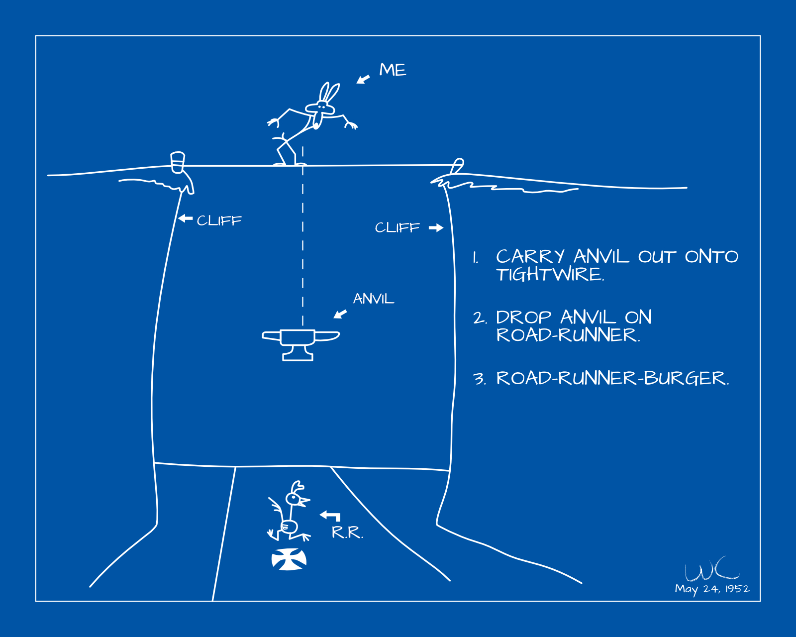
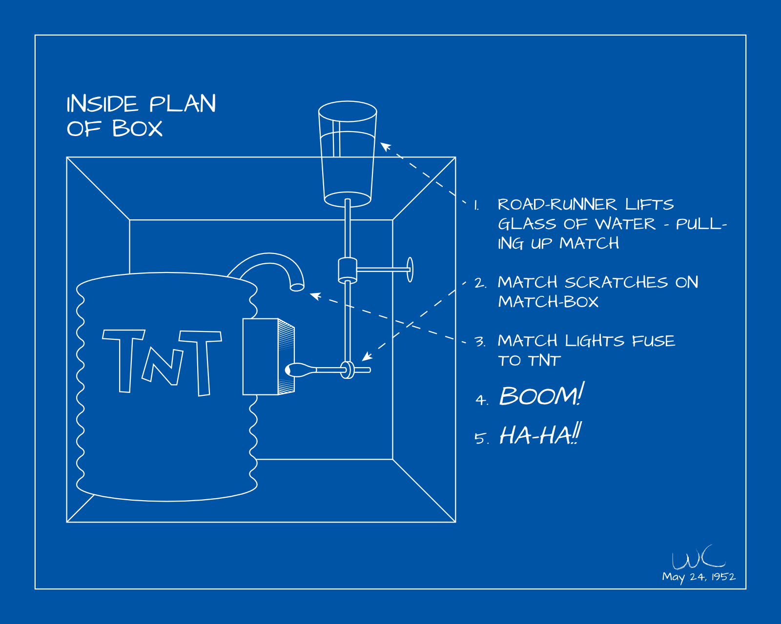
I screen-grabbed some shots off of a Laser Disc compilation of Road Runner shorts and redrew them using Affinity Designer. I tried to be true to the source material so that the images would be clearly recognizable. I took some liberties by straightening some lines, using a font instead of hand written letters, etc., and I am pleased with the results.
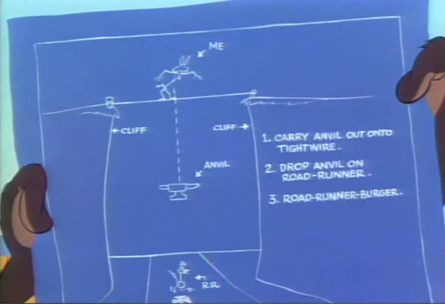
Screen capture from Laser Disc
In this first scene, Wile E. Coyote plans to drop an anvil onto an unsuspecting Road-Runner from a tight-wire strung across a gorge.
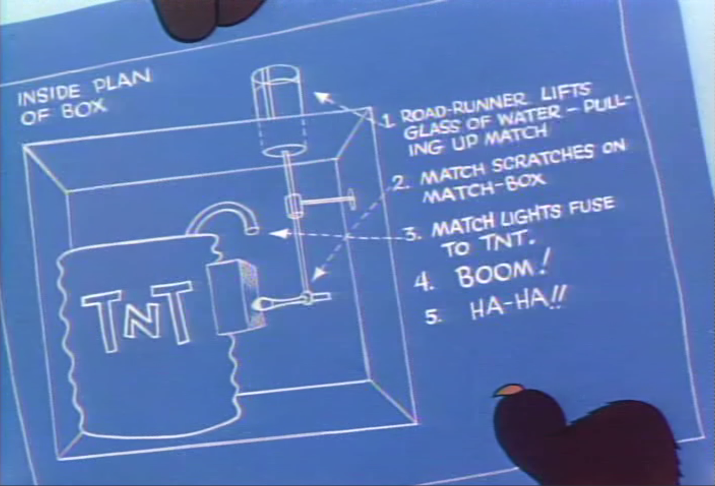
Screen capture from Laser Disc
In this second scene, a box is rigged to explode when the water glass is lifted. One of the things I love about the box is that even though it is introduced near the beginning of the episode, the payoff comes at the end after the viewer has probably assumed the gag was over and not going to be revisited.
While, I don’t want him to hurt the Road-Runner, I do feel a sense of pity for him and all the pain he has to endure for the audience’s enjoyment.