LCARS, the Library Computer Access and Retrieval System, is the fictional operating system used in the 24th century on Star Trek the Next Generation, Voyager, and Deep Space Nine. LCARS was designed to be a futuristic looking computer interface, while being very cheap and easy to create for the sets. In the show’s production, the effect was made by taking plexiglass sheets, applying vinyl shapes to the glass, then back-lighting it. It was a great effect and really sold the futurism that was felt when looking into the world of the Enterprise D. The entire design of the Enterprise D is very special to me, and seeing it gives me that nostalgic sense of coming home.
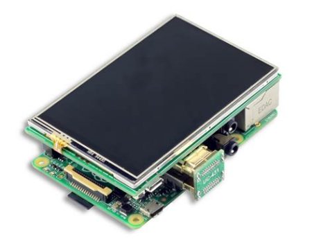
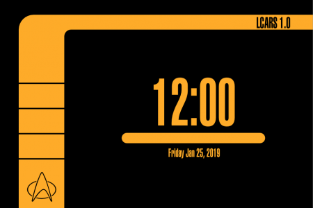
I recently found a small 3 inch display for the Raspberry Pi. It was only about 20 dollars, and I thought that was really nifty, and bought it without really having an idea what to do with it. After I got it, It seemed so neat that I thought it would be so cool to display something on it with an LCARS style interface. I like clocks, so why not start there?
After looking for something ready-made and not finding anything I really liked, I decided to make my own. On my list of things to do was to try using SVGs to make a website. This seemed like a perfect opportunity to do just that.
SVG (Scalable Vector Graphics) is a format that describes graphics by lines, curves, and points. I’ve used SVG a lot in design projects but not much in online applications. I started out by creating a basic design on Affinity Designer to the scale of my little screen.
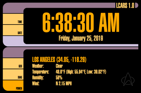
Once the design was prototyped, I saved the file as an SVG and created an HTML wrapper around it, and began getting it set up. I started writing the Javascript that would actually display the time. That was pretty easy as it turns out. I was so pleased by the results, I decided to expand upon it, and add weather to the display.
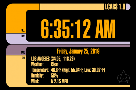
To add weather, I had to do a few things. The first was get the location of the user. I wanted to avoid having to input anything and wanted the geolocation to be automatic. This is pretty easy using the built in command on most browsers.
navigator.geolocation.getCurrentPosition()This will pop up one of those confirmation dialogs that the website wants to use the user’s current location. In the event that the user selects no, I wanted a fall-back solution as well. This is done using a free service from geoiplookup.io. They have an API that requires no key that returns JSON data.
Between the two of those options, I now have the approximate latitude and longitude of the user, and can query a weather website about the weather. I am using open weather map for that. They require registration to use the API, but it is free and caps out at 10,000 queries a month. That’s about 13 times an hour. For now I decided that 1 update an hour would be enough.
Their API returns JSON data that is easily parsed to get the weather and other things. Things are looking good.
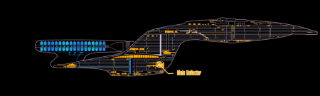
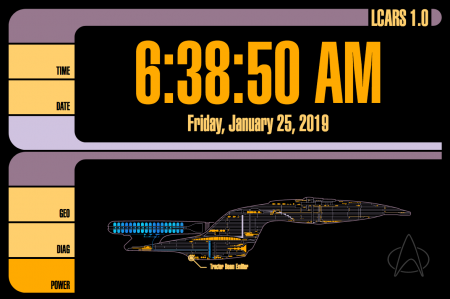
Now I decide that I have these elements just sitting there, surely I could do something more interesting with them. What’s really cool about SVG is that the elements are just like HTML elements, and that makes it really easy to use with Javascript. I decided to make buttons on the side to do more than just label things. Clicking the time button cycles format (blinking separators, 24 hour, etc) and clicking the date button cycles date formats (US, ISO, Star Date, etc). Lastly, I decide to add a diagram of the Enterprise that replaces the weather data when “Diag” is pressed. I happened to have a vector drawing of the Enterprise that I made a few years ago that I could repurpose.
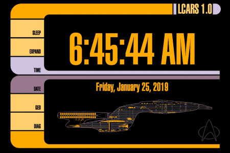
It looked spectacular. I was very happy. But like all projects, it’s fun to keep fiddling. The next step was to make the diagram less static. This time, instead of using Javascript to affect the image, I decided I would try SVG animations. These were completely new to me.
I wanted the nacelles to have the the flowing blue texture that we often saw in the TV show. I made a mask, and a gradient map in Affinity Design and then created an SVG animation where the gradient would pass behind the mask and move 30 pixels, then reset and repeat. It looked so great!
  <rect x="1" y="20" width="150" height="46" style="fill:url(#_Linear2);">
    <animateMotion
         path="M35,0 5,0"
         begin="0s" dur="1s" repeatCount="indefinite"
         />
  </rect>
Next, I decided to add points of interest to the diagram. I created all the points by hand and then used SVG animations to make them appear and disappear sequentially. This is done by having the animations kick off when they see the previous animation being completed. Once I overcame a few pitfalls, it came together great and was really easy.
Lastly, I wanted to move the diagram out of the main HTML. The SVG data was really cumbersome, and I wanted to have it be isolated for clarity. This was done by moving it to it’s own document, and giving it the proper SVG tags. In the HTML, I created an image tag that links to the SVG file, and then wrapped it in a g tag with a transform command so I can place it correctly within the main graphic.
    <g id="diag_data" transform="matrix(1,0,0,1,75,180)" style="display:none;">
      <image x="0" y="0" width="380" height="150" xlink:href="diagram.svg" />
    </g>
There is only one minor problem now… I’ve defined a custom font in the main HTML, and the embedded SVG can’t use it. Additionally, defining a custom font in the embedded SVG file does work when looking as the file directly, as soon as it is embedded using and image, img, or object tag, the fon’t definitions break. I believe this is a security thing, but I’m not really sure. The only way I could find to solve this problem was to embed the font as data in the SVG file.
I used a service I found at font-converter.net that gave me the encoded data, and then I put it into the SVG file. It worked like a charm. It’s not super pretty, but it worked.
<style type="text/css">
<![CDATA[
@font-face {
    font-family: 'lcars';
    src: url(data:application/x-font-woff;charset=utf-8;base64,d09GRgABAAAAAF2IABEAAAAAkoQAAQAvAAAAAAAAAAAAAAAAAAAAAAAAAABGRlRNAAABgAAAABoAAAAcGo5L0kdERUYAAAGcAAAAHwA... continues ad infinitum...) format('woff');
}
]]>
The result is about a day’s worth of tinkering, and I’m very pleased with the result. I am also really excited about how easy working with SVGs was with Javscript, and want to find another project that gives me an excuse to tinker some more.
Update
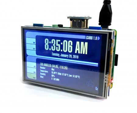 I had some trouble configuring the touch screen on my Pi. It seems like there was some information missing. The first thing is that the brand of touchscreen I purchased was Kuman, specifically the 3.5 inch HDMI screen. They have multiple models; some that use HDMI, others that use GPIOs. The original drivers I found for it were outdated and not meant for the current Raspbian OS. The newest drivers are available here on their GitHub page.
The second mistake I made was trying to install with the incorrect install script. I was using the “LCD35-show” script which is actually intended for the screen that does not use HDMI. That resulted in a black screen and no touch input. The correct installer for my screen is the “MPI3508-show”. After executing the script and rebooting, the screen worked correctly.