Icons

Another thing I like to do when I have nothing to do is to recreate recognizable icons. I like to see how closely I can approximate the original look, and often I can find new ways of using the tools available to me in Illustrator.

The Finder icon. This was simple really. Just something fun to do.

The QuickTime 7 icon. I made this one to practice using blend modes on gradients more effectively.

The new QuickTime X logo gave me an opportunity to use radial gradients, and customize their shape and placement.

The iChat icon let me try doing some more gradient blending modes, like the QuickTime 7 icon.

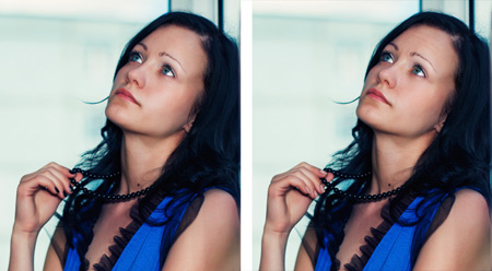
Photo De-enhancement

In this day and age, most people are concerned with their own vanity and “Photoshopping” away their imperfections. I however had an opportunity this past week to do quite the opposite. For the first time, I was asked to age a photo so that the subject looked a tiny bit older and more mature. This stock photography was destined to be used on an advertisement targeting middle aged women. The client loved the photo composition, but felt that middle aged women couldn’t relate to the youthful subject. They asked that some minor modifications be made in Photoshop in order to make this photo acceptable.

It may be hard to tell, but I added some wrinkle lines on the forehead as well as a few crows-feet around the eye. I tried to make the skin a little less shiny as well. Finally, I removed the black nail-polish for a more sophisticated french tip style nail-polish. I had to get this done quickly, so I did what I could. It was fun though to do something completely new.

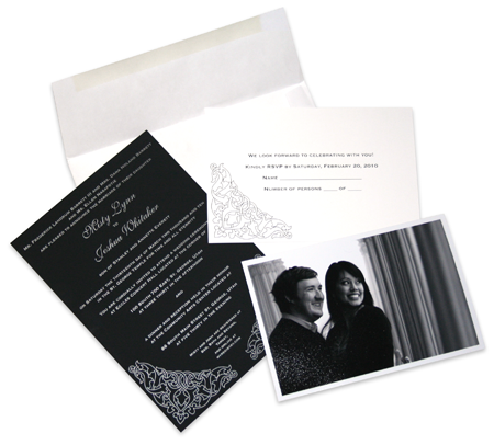
Invitations

My coworker is getting married, and I had the opportunity to help with the design of the invitations. These are a little different from anything I’ve done before. She wanted something simple, and modern, but to have a bit of a retro flare at the same time. We used a monochromatic theme which I think makes it look very elegant.

Misty's Wedding Invitation

The most fun part of it though was the opportunity to print on Touché Paper (produced by FiberMark). This paper is so beautiful, and has an amazing texture. It feels like a silky velvet, and is thick and impressive. It added another layer of interest to the over all look of the invitations. The photos were taken by my colleague, Joe Wilson, which turned out very nicely.

© 2007-2015 Michael Caldwell